
During my time working at an Alzheimer’s care center, we made a very conscious effort to use color contrast in everything from furniture to carpeting to wall colors. It was not uncommon to see some patients walk right by doors they intended to enter because the doors were painted the same color as the walls. Busy carpet patterns that matched colors of the room also created confusion, promptly careful and uncertain steps.
I cover these topics in my book, Staying Home: A Caregiver’s Guide to Making Your Home Alzheimer’s Safe.

- Grant, Derrick (Author)
- English (Publication Language)
Boston University researchers reported in the medical journal Clinical Nutrition in 2004 that patients with visual contrast of foods and beverages can help people with Alzheimer’s disease improve their food and liquid intake. They served nine men with advanced Alzheimer’s disease foods on white plates and in white cups and compared them to red ones.
The food and beverages on the white plates and in the white cups didn’t seem to provide enough color contrast for the patients to want to consume more food. But when high contrast dishes that were red were used 8 of 9 of the patients ate more food. In fact, they ate 25% more food and drank 84% more liquid.
The researchers commented that simple environmental manipulations such as contrast enhancement can significantly increase food and liquid intake in frail demented patients with Alzheimer’s Disease.
Changes in Vision from Aging that Affect Color Perception
There are a number of changes that affect our eyes as we age:
- Lenses Elasticity Decreases
By age 50, our lenses lose elasticity. This results in us getting prescriptive eye glasses or reading glasses.
- Lenses May Thicken and Yellow
This is the result of aging processes and poor nutrition. When the lenses thicken, less light penetrates the eye and a resulting reduction in visual sharpness and contrast of the retinal image.
- Lenses May Have Reduced Transparency
This causes a reduction in visibility due to too much light.
- Pupil Size Decreases
As we age, our pupils become smaller. This reduces the amount of light entering the eye and affects the ability to discriminate between green and blue shades to identify fine details.
- Diseases Accelerate Deterioration of Eye Functions
Macular degeneration, glaucoma, cataracts and diabetes affect visual acuity and the ability to discriminate contrast.
- Color Blindness
Color contrast may actually be decreased by different medications that cause color blindness. Some examples are digoxin, sildenafil (Viagra), anti-infection drugs including interferon-alfa, ethambutol (Myambutol), amiodarone (Cordarone), hydroxychloroquine (Plaquenil), metronidazole and some antimalarials. Certain drugs can damage the optic nerve over time.
An abnormality of blue-sensitive retinal cones causing color blindness has been found in those with Alzheimer’s disease. Research studies have shown that what is happening in the retina and eye structures is similarly occurring in the brain causing dementia.
When you can’t see the differences in colors, such as what happens in color blindness, you see the world completely differently. See this link to observe the color differences: This website also offers a color blindness test you can take to see if you (or your loved one) does have color blindness.
Why Color Contrast is Important for Those with Alzheimer’s

Most people with Alzheimer’s aren’t going to be driving a car and miss the changing green light to red. They won’t be needing to see a baseball pitch coming at them either.
And using color contrast isn’t important only for food consumption. It’s also important for colors in the environment of where the patient lives or stays. Since most hospital or long-term residential care settings have white walls and light-colored floors, there’s not much contrast. Add light-colored furniture to the picture and all you really have to a dementia patient is a mass of one color and that’s it. Everything looks the same.
Thus, the question asked is whether or not the residence is helping or hurting the patient with Alzheimer’s. And it’s not so much a matter of hurting that patient but rather is the environment conducive in any way of helping that patient improve.
So builders and interior decorators are making changes to the living areas where those with Alzheimer’s disease live. Here are some examples of what they are doing:
- No more white toilets with white floors and walls.
- With different colored frames around a door, doors are more obvious to see.
- The upholstery on the chairs has to be a different color than the floor.
- Table settings have to contrast with the color of the table and the tablecloth.
- People with dementia perceive a black mat in front of a door as a black hole so they won’t go near it; thus colored mats are used.
Other Places Where to Use Color Contrast
Your goal in changing the home environment to accommodate someone with Alzheimer’s dementia is to provide a supportive environment that allows the person to have the ability to function and orient independently in it. It’s called a visual barrier in independent living when a dementia patient’s environment works against him or her.
- You can also use wall art or tapestries on the wall to clearly show that the walls are different from the floors.
- Sometimes floor coverings will run up the side of the wall. If your loved one has dementia, it will be important for him or her to tell where the floor ends and where the wall begins. This can be done by making sure the floor covering does not run up the side of the wall.
- Sometimes in a house there’s a step to get into a den. In cases like this, you need highly contrasting colored materials in the floors which will be seen as a change in floor level. In other areas of the house where the floors are all level, the colors should be close to the same color.
- Using pale colors prevented patients from wandering in restricted areas such as exits, staff areas, etc. These colors include hues from the extremes in the color wheel such as red, blue, purple, and black.
Colors to Avoid

An Italian study gave a color test to those who were cognitively impaired to see how their emotional state was coinciding with the colors they chose. The Alzheimer’s patients who were cognitively impaired mainly chose violet and brown, and rejected black and gray. Their results suggested that Alzheimer’s disease patients live with the feeling that their whole world is going to change, instability, and emotional insecurity. They were physically uncomfortable and had a bodily need of being welcomed in a favorable environment. They needed others to be sensitive to their needs.
Color Therapy Can Help
Color therapy is the use of colors to generate certain types of feeling in a person. The use of color in the living environment of the elderly and visually impaired is called the functional application of color.
Below is a chart of the different colors and the emotions they are associated with.
| Color | Emotions Generated | Application |
|---|---|---|
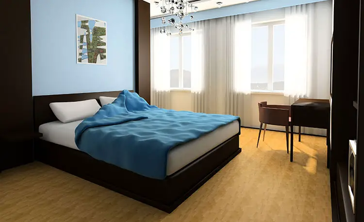
| Blue | Calming, restful. Tranquility. | Good for bedrooms and quiet rooms. Use cool blue to make a room appear larger. Blue may lower blood pressure. |
| Green | Growth, new life. Reduces activity in the central nervous system. | Evokes generosity. Thought to improve vision. Green is the last color that goes away in the dementia patient’s perception of colors. Lime green may be used to increase visual attention. |
| Red | Increases brain activity. Stimulates adrenaline production. Symbolizes strength and vitality. The most emotionally intense color. Increases appetite. | Good for rooms where there’s a lot of activity occurring. The room will seem warmer with red colors. Red also symbolizes luxury. |
| Orange | Associated with nature and natural environments, sociability and happiness. | Stimulates enthusiasm and creativity. |
| Purple | Color of royalty. Dementia patients view things that are purple as sacred. | The Alzheimer’s Association uses a darker shade of purple as their official color. Represents clarity of mind or wisdom. |
| Yellow | Speeds up metabolism. Cheerful (think emoticons). However, people tend to lose their tempers more often in a yellow room. | Associated with safety. Using stripes of yellow on stair treads may be effective to signal potentially hazardous conditions. |
| White | Associated with sterile conditions or cleanliness | |
| Pink | Reduces anger and aggression. | Used to reduce combative behavior |

Researchers have shown that bright colors contribute to accelerated mood enhancement and the high color contrasts in the living environment is a useful tool to improve the visual clarity of the surroundings and spatial orientation.
Specific applications of color coding were found useful for improving the memory of those with cognitive impairment and the individuals living there found it easier to negotiate their living environment. Using bright colors provided more positive emotions and a positive atmosphere.
If you want the official Cooper model for home modification created by the researcher Cooper in 1985, it’s below and will tell you how to do it according to homemods.info:
- Identify the purpose of the color intervention.
- Identify all types of limitations to implementing the color intervention (lighting, structure, budget, etc.)
- Establish and rank specific priorities for the use of color (individual, cultural, organizational factors)
- Locate the objects that will receive the color intervention.
- Acknowledge the specific colors of the identified objects.
- Choose appropriate background color by using the model’s contrast rules (hue, light/dark, warm/cool, complementary, simultaneous, saturation, extension) and visual enhancement factors (lighting, matte surface, peak sensitivity, and size).
- Make any necessary modifications to the chosen color intervention.
- Decide on the method of color application.
The bottom line here is that color affects those with dementia. Use color to their advantage.